
Created with everything we got :
our sweat and tears\mind and soul\time and effort
#BS_Case:
Tomoko’s Pure Honey is a pure artisanal honey brand with a variety of delicious flavors that fit all meals of the day. With honey sourced directly from the beautiful province of Selenge, founder and CEO Tomoko Ibukuro’s passion for bee agriculture seeps into every product.
#BS_Challenge:
To rebrand Tomoko’s previous Mihachi Honey brand on national television and develop a new brand look and strategy that increase sales and profit.
#BS_Solution:
Brand audit on the Mihachi Honey brand revealed that it wasn’t driving up sales for three main reasons:
1. The package design didn’t stand out from other brands.
2. The Mihachi name wasn’t easily memorized by Mongolians
3. The brand strategy didn’t effectively use its most valuable marketing asset -
Tomoko’s charisma and fluent Mongolian tongue.
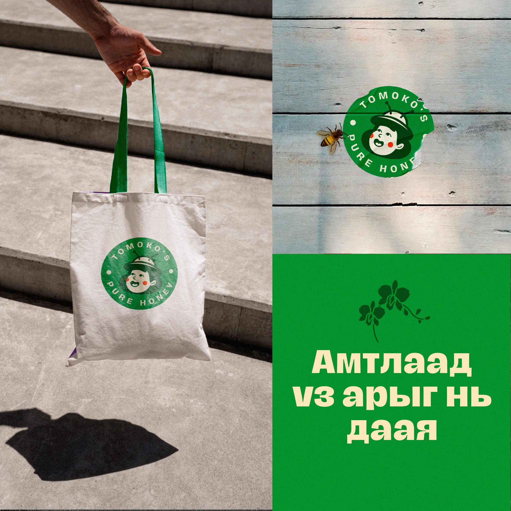
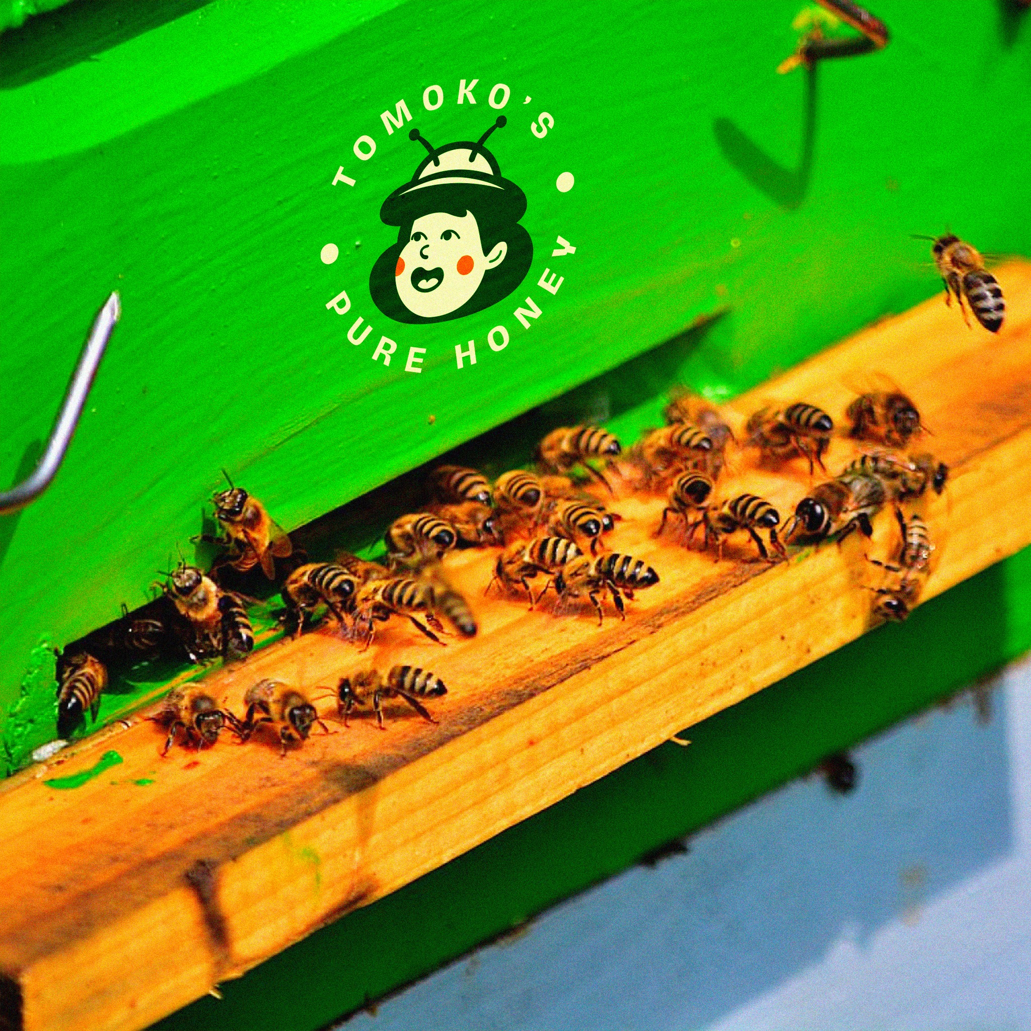
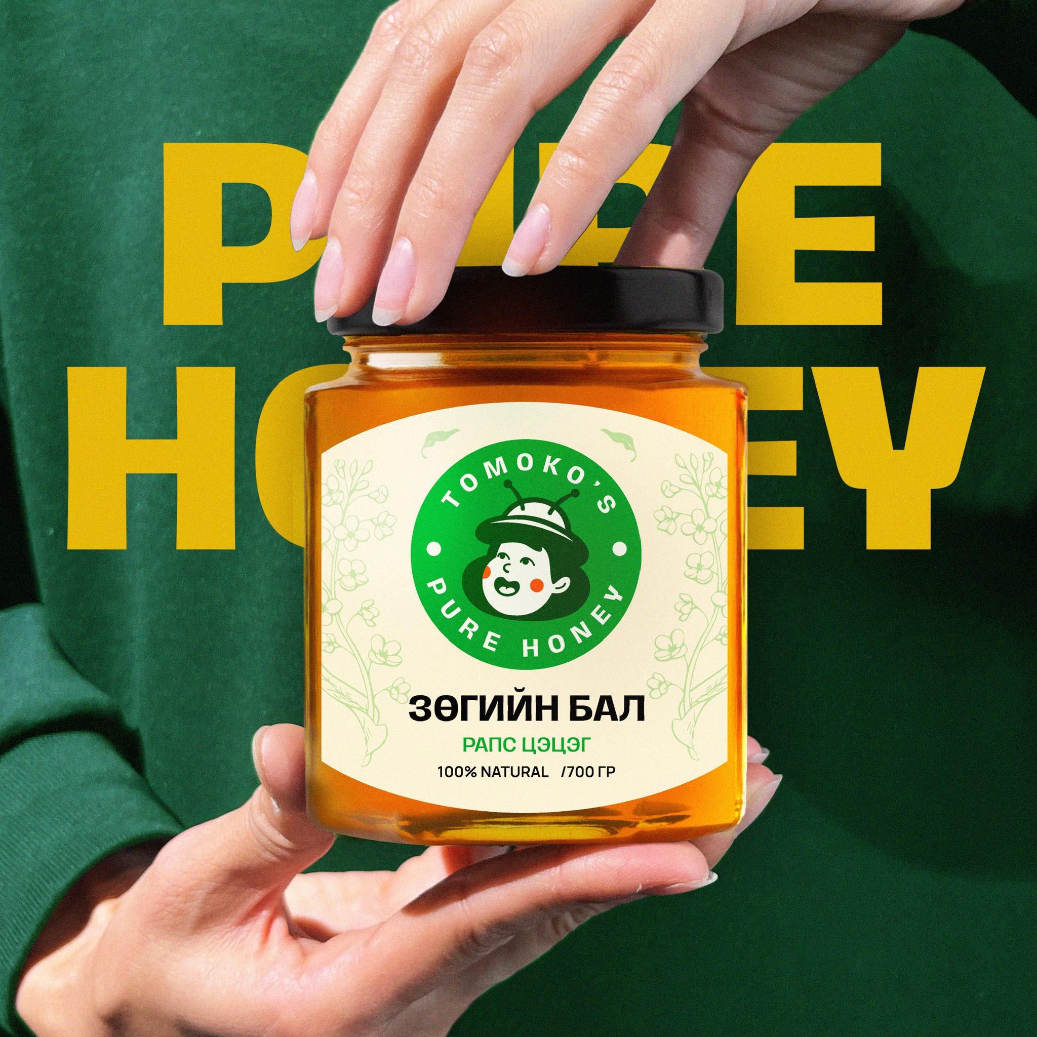
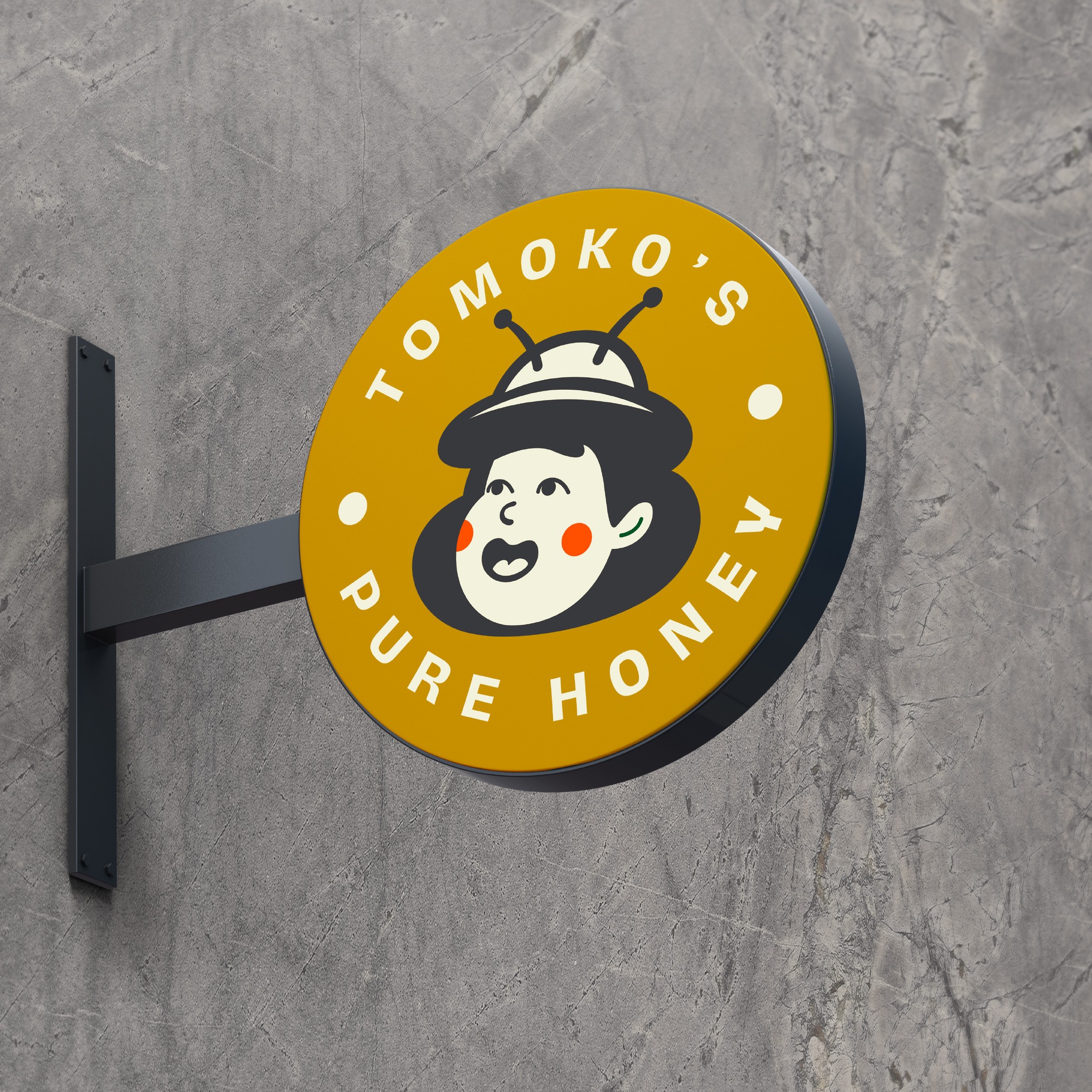
We solved all three problems by implementing a strategy that placed founder Tomoko at the center of the brand. We rebranded Mihachi into Tomoko’s Pure Honey, creating a new logo with a cartoon head of Tomoko smiling and wearing a bee hat. Her cheeks are blushing red, a symbol of ripeness and warmth.
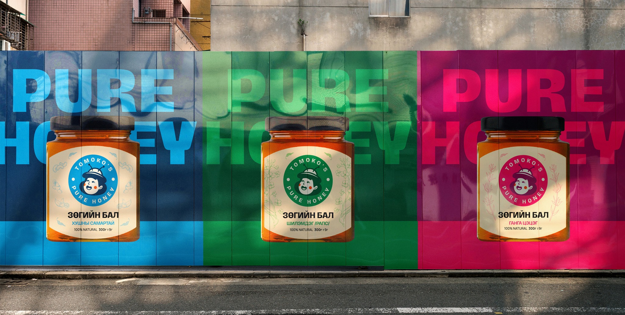
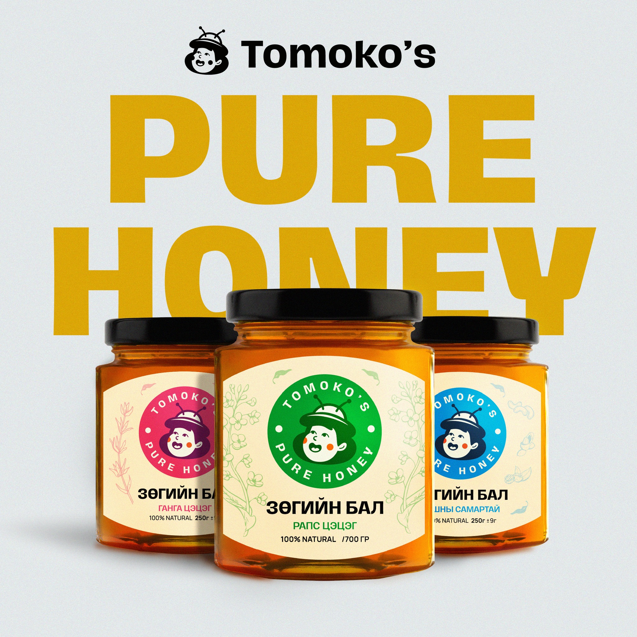
The visual identity is complete with vibrant colors that evoke summer colors, each signifying the brand’s variety of flavors offered. All against a uniform backdrop of neutral beige that evoke organic, handmade and eco-friendly feeling. The new typography is bold and easy to read, opposite of its previous handwritten-style. The new package design is friendly, adorable and most importantly, stands out from competitors on store shelves.
In line with our rebranding, we developed a brand strategy that amplified these assets and utilized Tomoko as the brand’s main spokesperson and marketing asset, such as creating a web series that teaches creative recipes and ways to eat honey on a daily basis with Tomoko as the host. This helped spread the culture of honey in the Mongolian market.
