
Created with everything we got :
our sweat and tears\mind and soul\time and effort
#BS_Case:
A seamless integration of fintech and real estate management, Rentpay is a one-stop solution to all renter and rentee needs. With Rentpay, renters can now rent and pay from month to month without the burden of 3+1, 6+1 payment bundles that put a strain on millennials and young families’ finances.
#BS_Challenge:
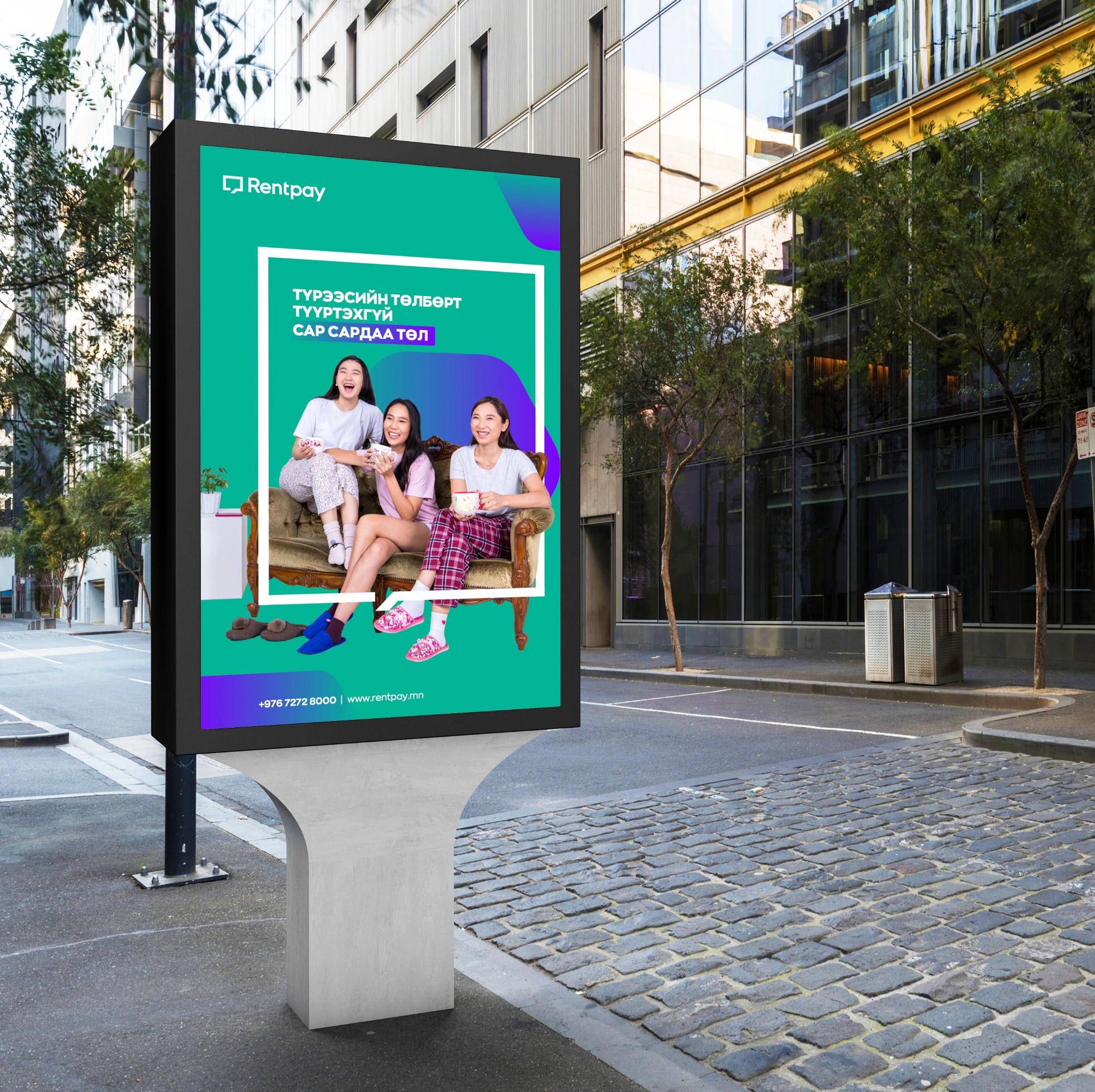
To create a well-rounded and approachable brand identity (logo, slogan & visual identity) that conveys RentPay’s novel technology and service to the mass market. To formulate a communication strategy and design that directly hits RentPay’s target audience and mission statement.
#BS_Solution:
As Rentpay directly targets millennials and young families who prefer renting a home instead of buying, it is crucial that we made Rentpay’s branding as approachable, simple and energetic as possible. The logo is simple and straightforward: a minimalistic top-down plan of a home as used in construction blueprints. The logo’s open door illustrates a property waiting to be occupied - waiting to be a home.
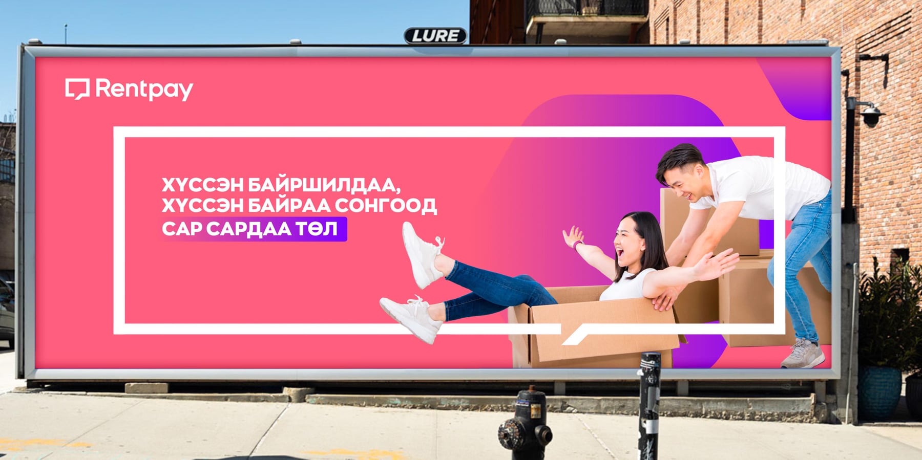
The brand pattern features the logo in sequence, depicting neighboring homes. The logo also doubles as a speech bubble, highlighting communication solutions between renters and rentees and their customer experience. At Rentpay, user experience is what matters and this can be seen through their communication design.
The brand’s visual strength and energy come from its vibrant color scheme. Bright french violet takes the center stage alongside pink, orange, green and blue as secondary colors. In color psychology, violet signifies luxury, wisdom and transformation. The meaning of purple fits in well with Rentpay’s mission statement. They offer smart, one-stop solutions to renters’ problems, allowing renters to enjoy a stress-free life that can open the door to new opportunities.
