
Created with everything we got :
our sweat and tears\mind and soul\time and effort
#BS_Case: To bring the opportunity to let sports fanatics not to miss out on sports big moments, two of the biggest sports channel in Mongolia, Unisports and SPS, merged together to create a brand new network.
#BS_Challenge: Our challenges were to create a brand new sports network from the scratch starting from the name, logo, color and identity; to demonstrate its technological advancement, professional performance.
#BS_Solution: To begin with, selecting a suitable name, creating a concept for the new channel, and suggesting three different approach to the client was bliss and joy to work with.
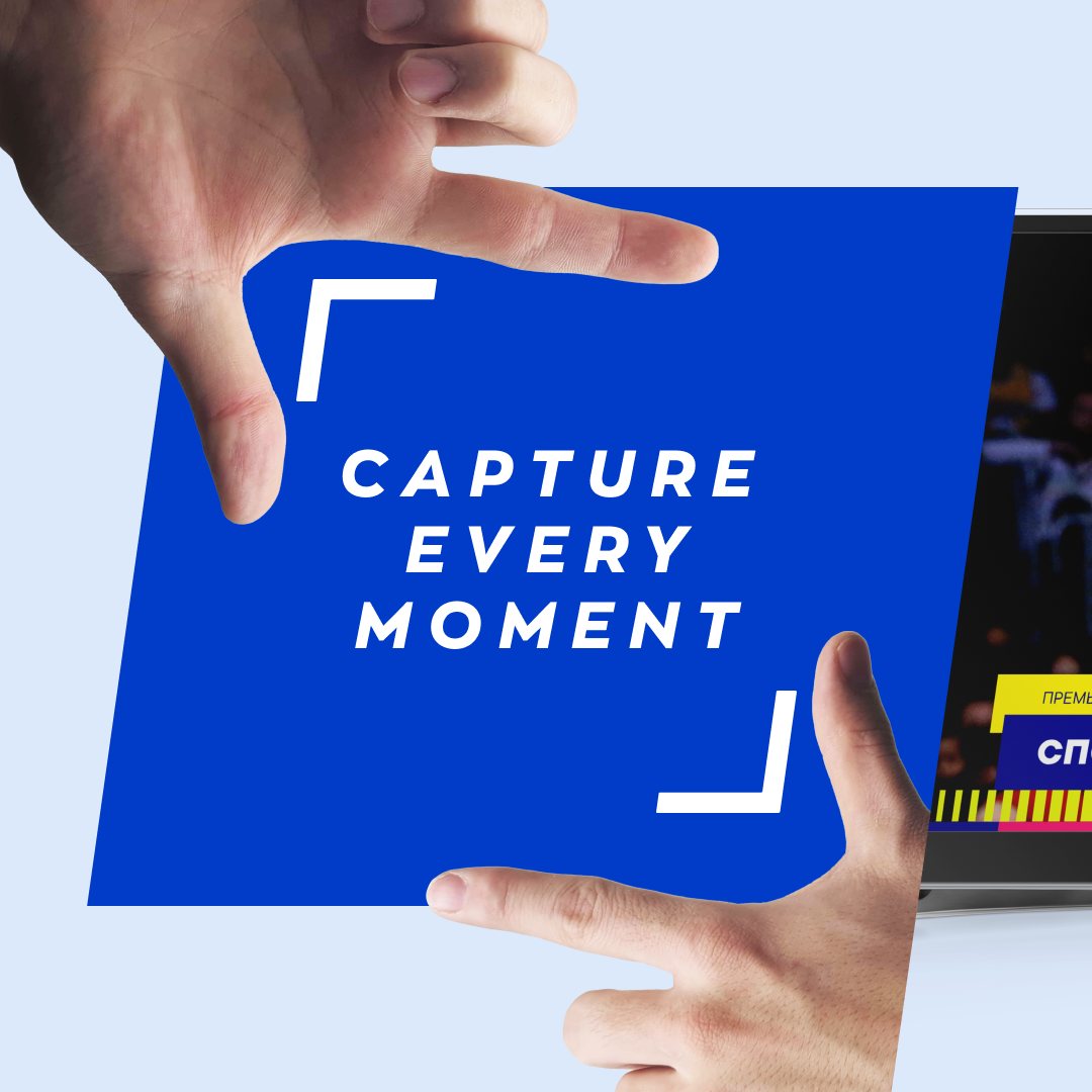
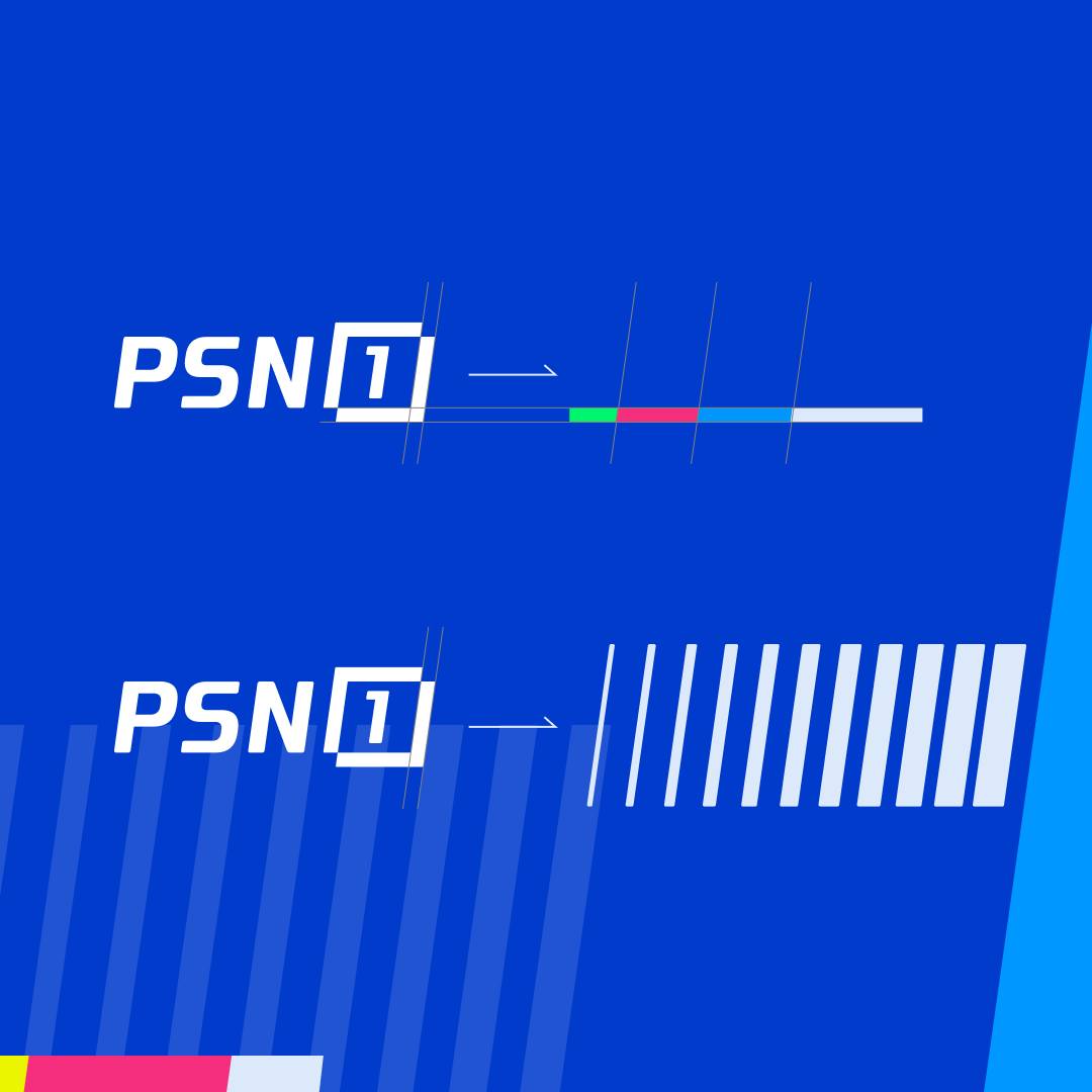
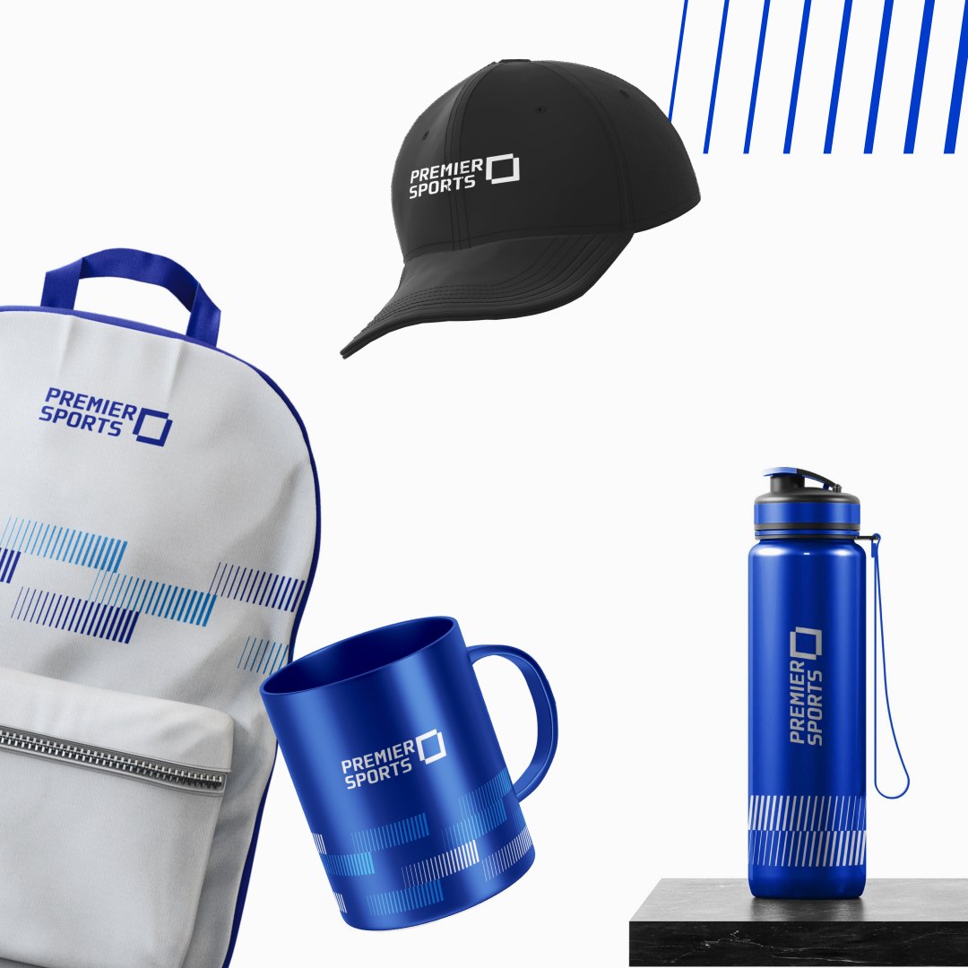
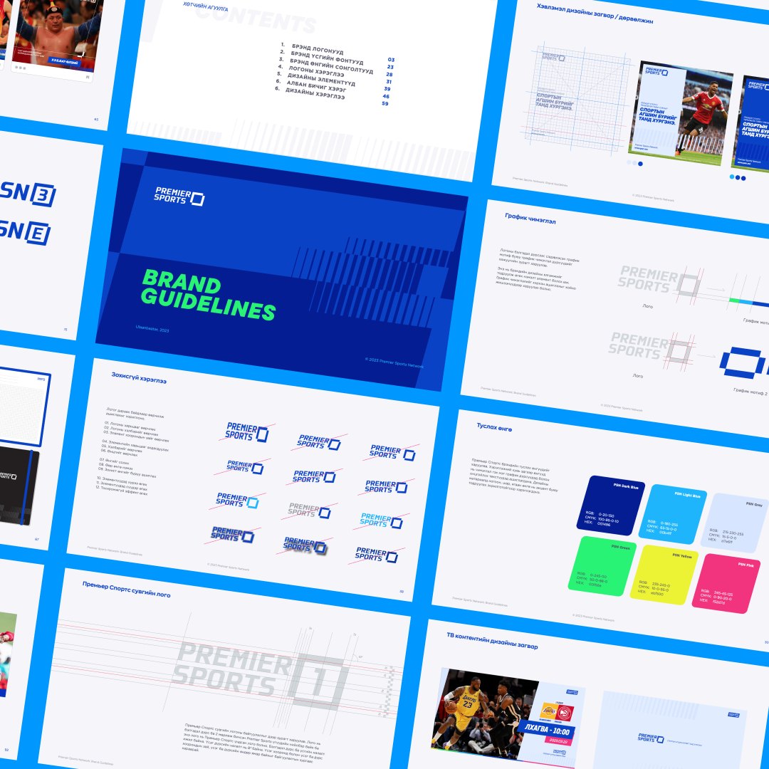
The client chosen styles-cape and concept for “Premier Sports Network” was the “CAPTURE”. The idea behind was to capture a moment, an action, or emotions of both players and audiences. The logo made for Premier Sports came from an idea of a hand gesture symbolizing a camera, in which we use it to shoot a split second into a permanent history we observe and see in sports. In other words, we wanted to make Premier Sports Network a sports channel where every moment is lasting. In total of 6 channels of PSN, to differentiate each of them, the numbers and letters are presented within the box of the main symbol.
One of the main technical challenge we have faced was to avoid using the main colors from both our clients’ former channels, respectively. To bring the solution, we considered the royal blue most suitable in this case, due to its bold, strong, and sporty feeling.
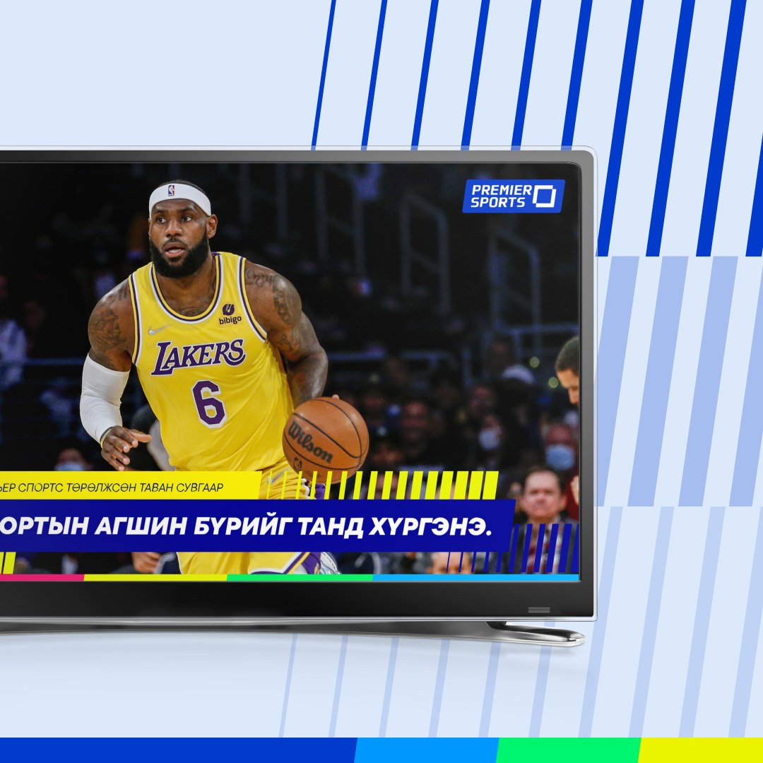
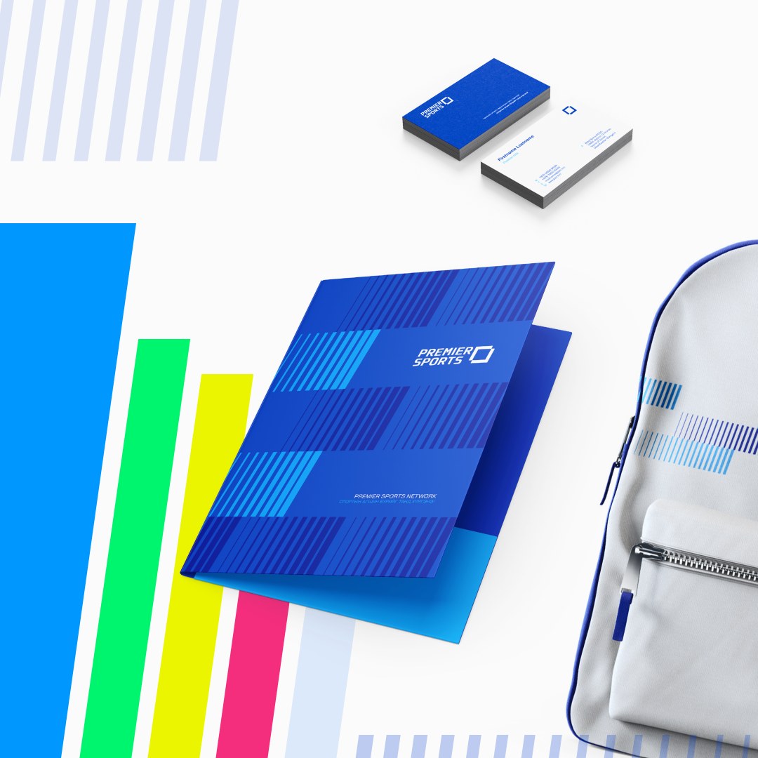
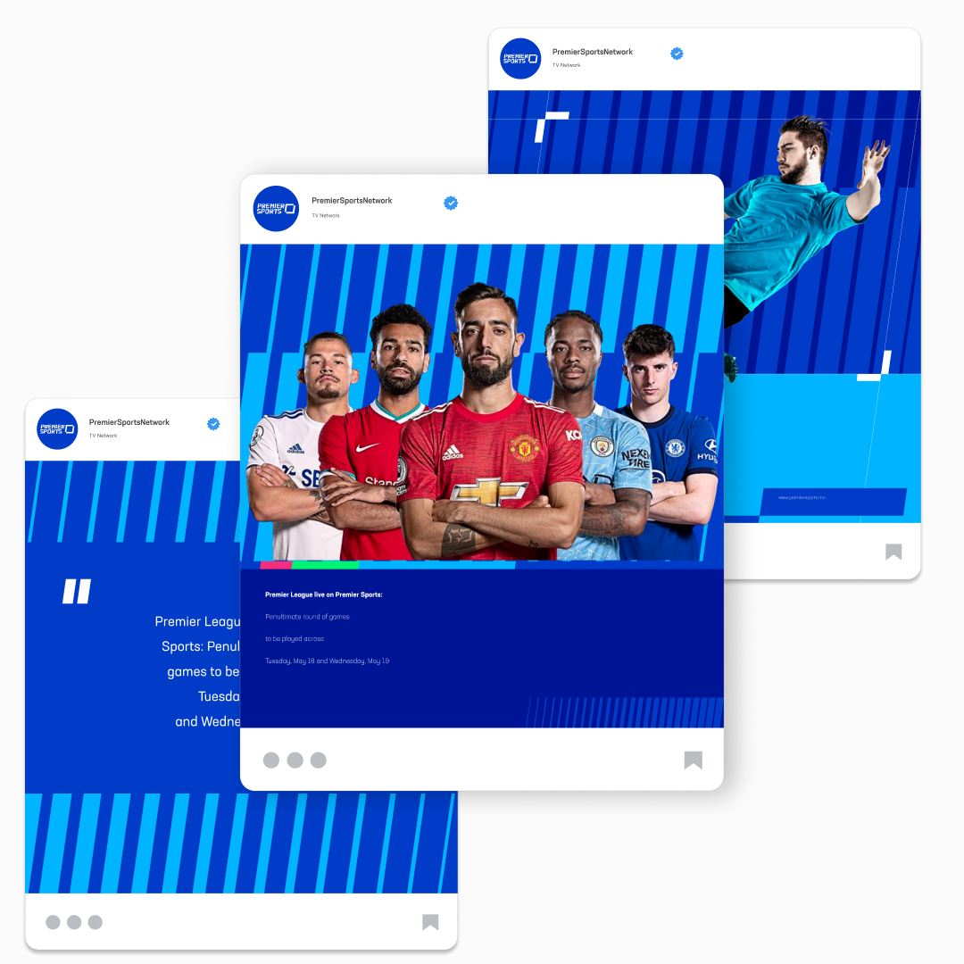
Finally, the visual identity for Premier Sports is derived from the main Logo slant. Slanted Typo, and Logo indicates movement, speed, and action. To emphasize and illustrate such identity, our motif and pattern use the same method to show movement, and change with colors, width, or size. Now it is time to capture the sports world with PSN, together.


