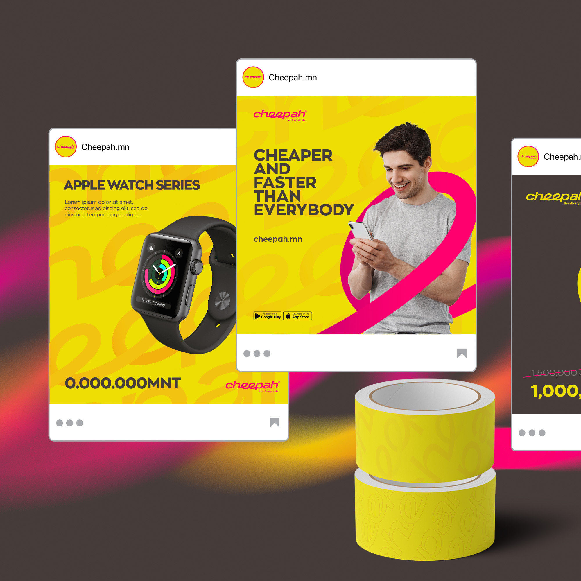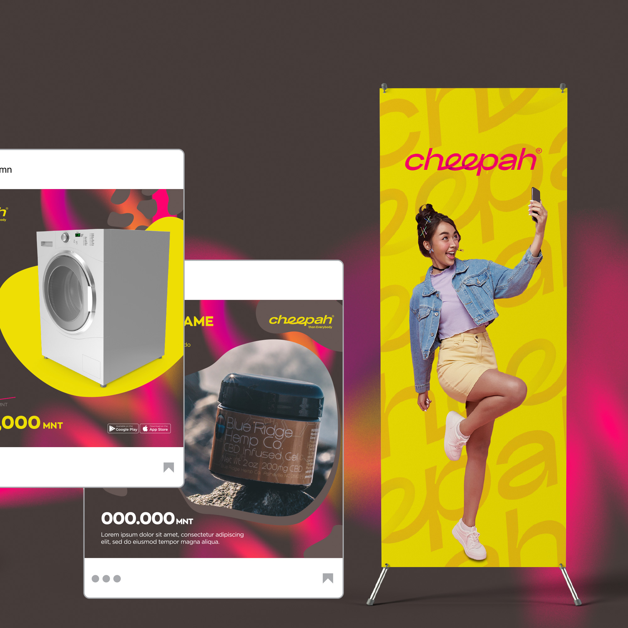

Created with everything we got :
our sweat and tears\mind and soul\time and effort
#BS_Case: Cheepah.mn is a new e-commerce platform that gives shoppers the opportunity to surf and shop from China’s largest B2C online retail store, Tmall (Taobao Mall), and its millions of official vendors at original retail price without going through third-party wholesalers and middlemen that sell goods at multiplied price points.
Backed by Mongolia’s largest shipping-and-cargo company, MonLogistics Group, Cheepah.mn offers fast and reliable ground shipping directly from the source.
#BS_Challenge: Cheepah.mn is faster, cheaper, and more enjoyable than all оther e-commerce sites on the market. Our task was to create a new brand from scratch that fully captures MonLogistics’ disruptive new service and to create a brand identity that speaks to its customer base.
#BS_Solution: First on the list was to conceive a suitable, simple yet striking name for the website. The winning name, Cheepah is a combination of two words that define the business’ central value proposition: cheetah (fastest land animal, fastest ground shipping supported by MonLogistics) + cheaper (ability to buy at an original retail price directly without added cost from wholesalers and middlemen).
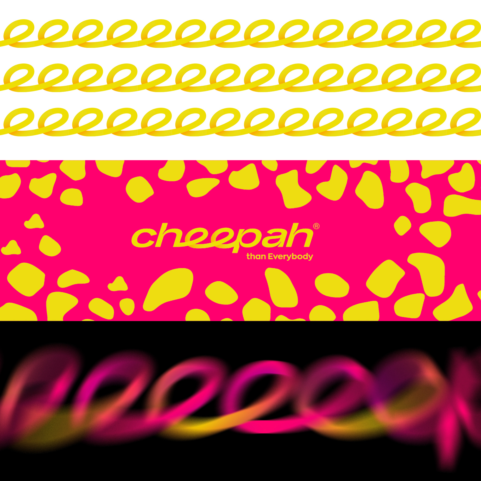
Just like its name and business USP, the visuals had to be unconventional yet alluring. The logo is a straightforward wordmark with two loops for “ee,” illustrating a connection from point A to point B and Cheepah’s logistics-backed operations.
The color scheme uses sunny yellow, which releases the happiness hormone serotonin, and magenta pink, which uplifts the mood and creates universal love. This color combination grabs the eyes’ attention while leaving a positive, happy impression.
The brand motif features blurs that indicate speed. The animal prints appeal to the largest e-commerce demographic, women, and represent the website’s disruptive price point.
